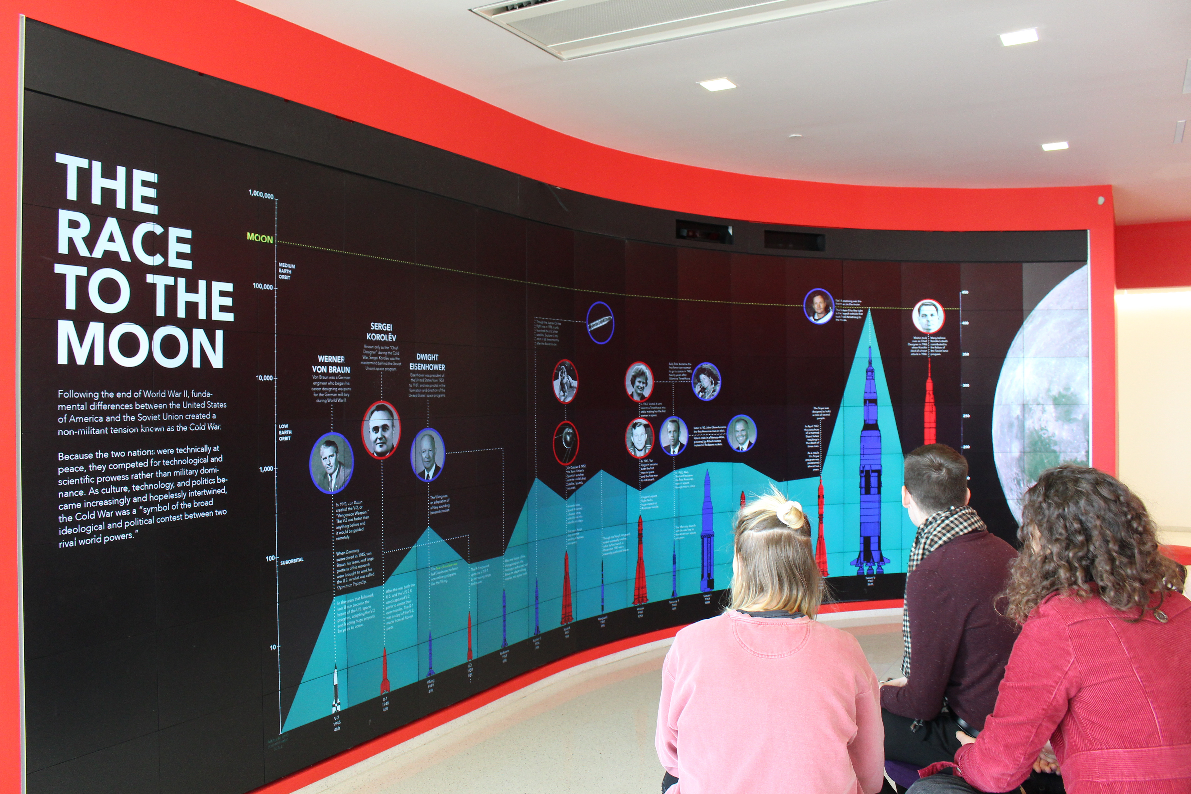
The Race to The Moon is a non-linear random-access infographic breaking down the events of the Space Race. The focus of the project was to create a graphic that communicated complexity and that could be read in more than one way. and It was designed for the iPearl Immersion Theatre, a 16 x 7 panel screen at Hunt Library on NC State's campus.
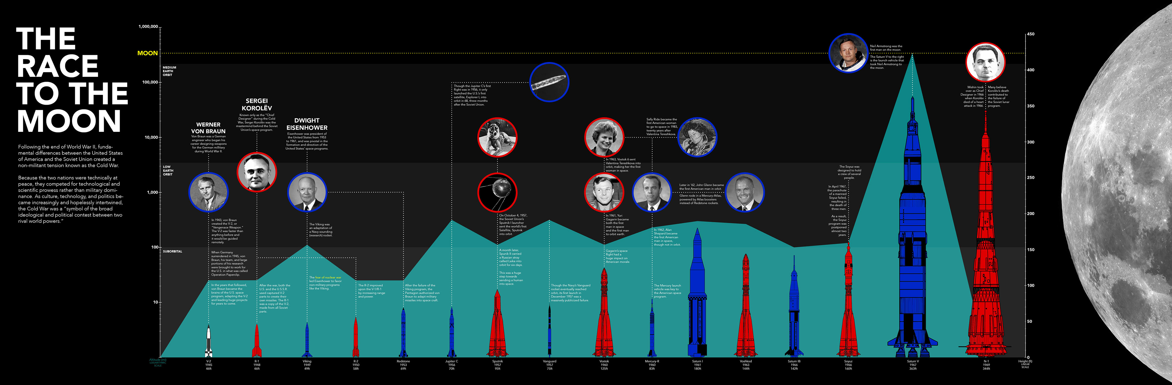
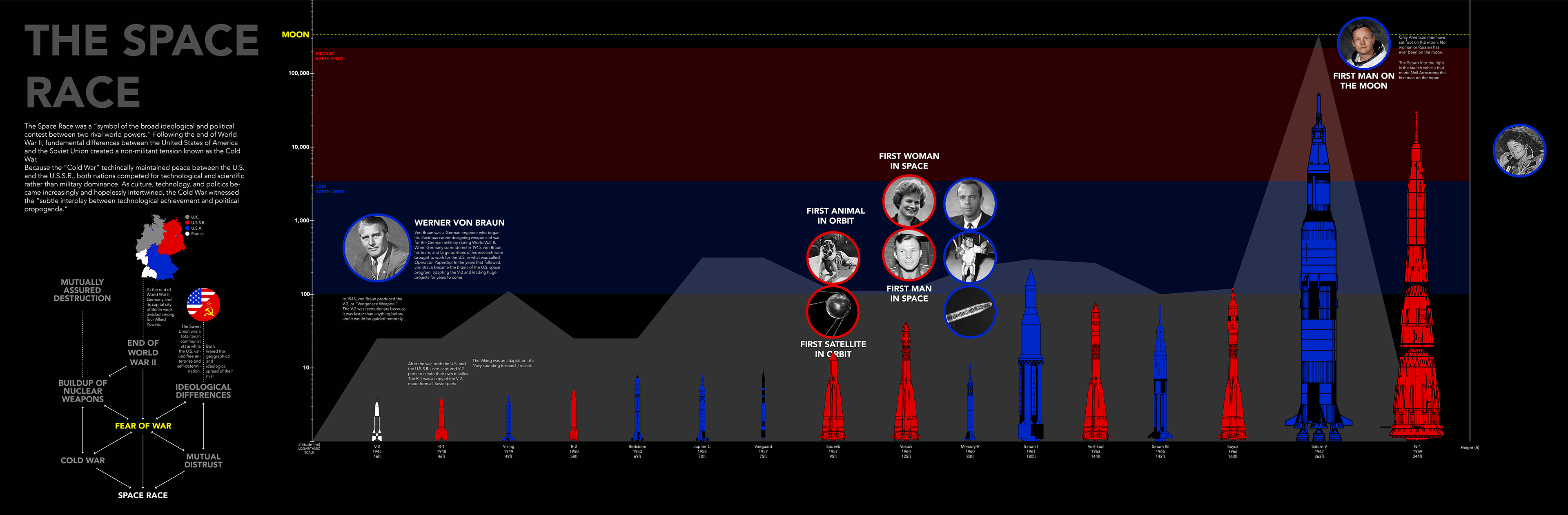
The graphic shows the development of both Soviet and American aircraft shown in red and blue respectively, with the height each rocket reached represented by the teal form in the background. The horizontal sections are indicative of the different layers of the atmosphere, and the yellow line is the distance to the moon. The distance into the atmosphere is based on the logarithmic scale on the left vertical axis, while the heights of the rockets is measured by the linearly-scaled axis on the right. Key figures and critical events in the development of the space race are highlighted in the circle images and are color coded to match the country they represented.
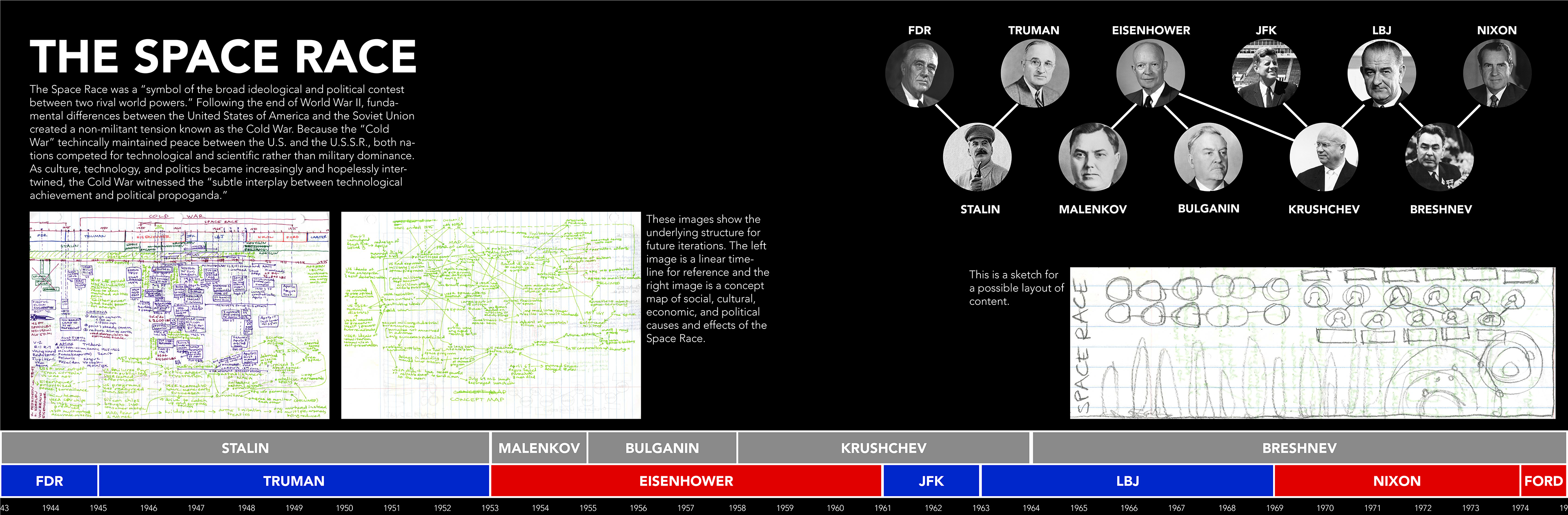
PROCESS
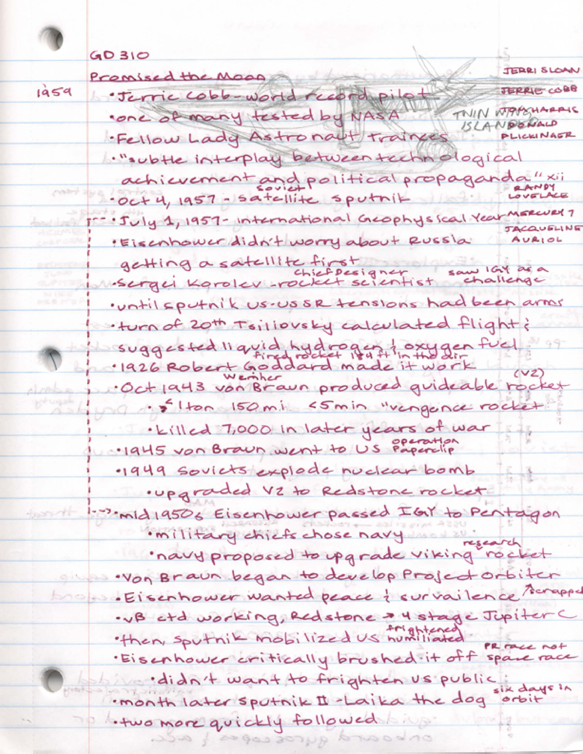
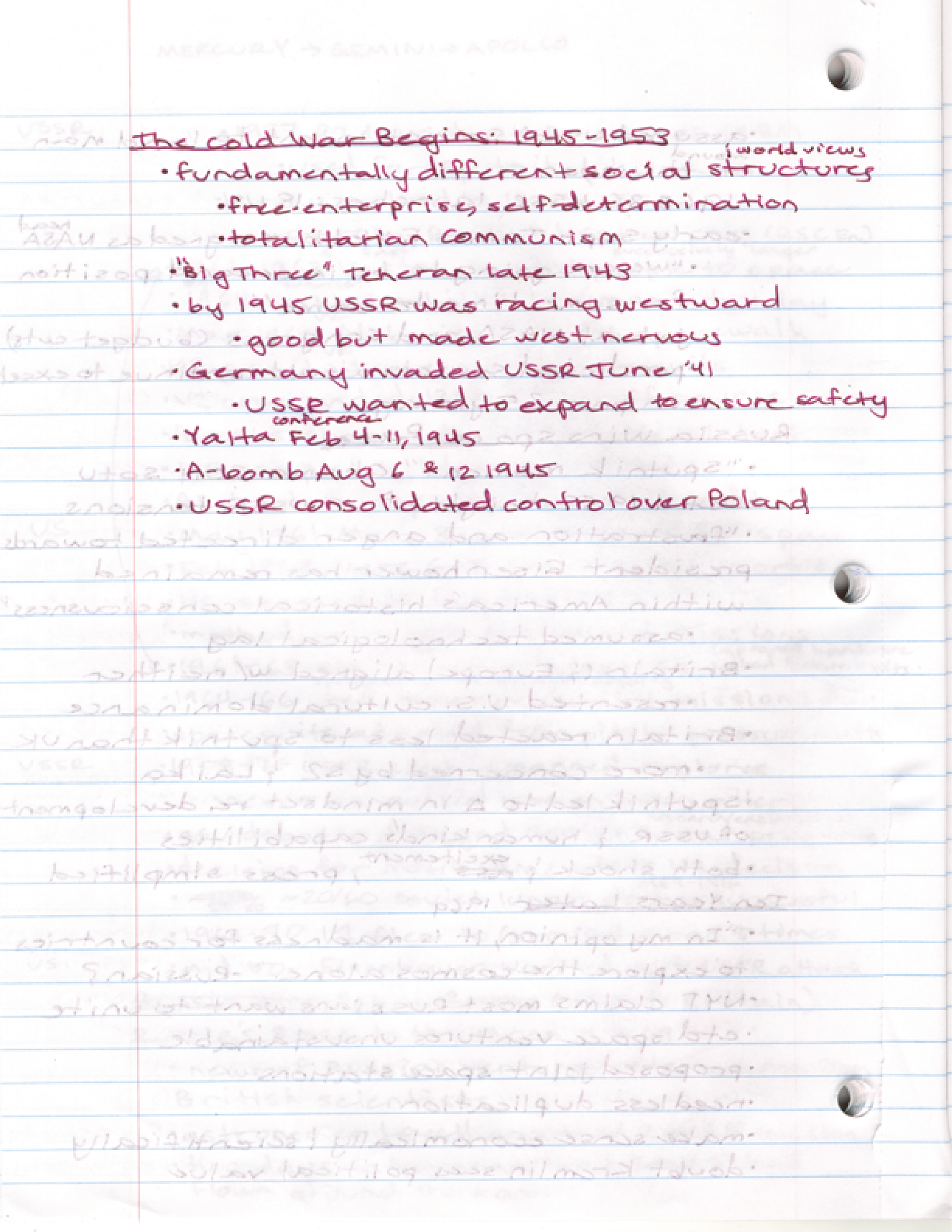
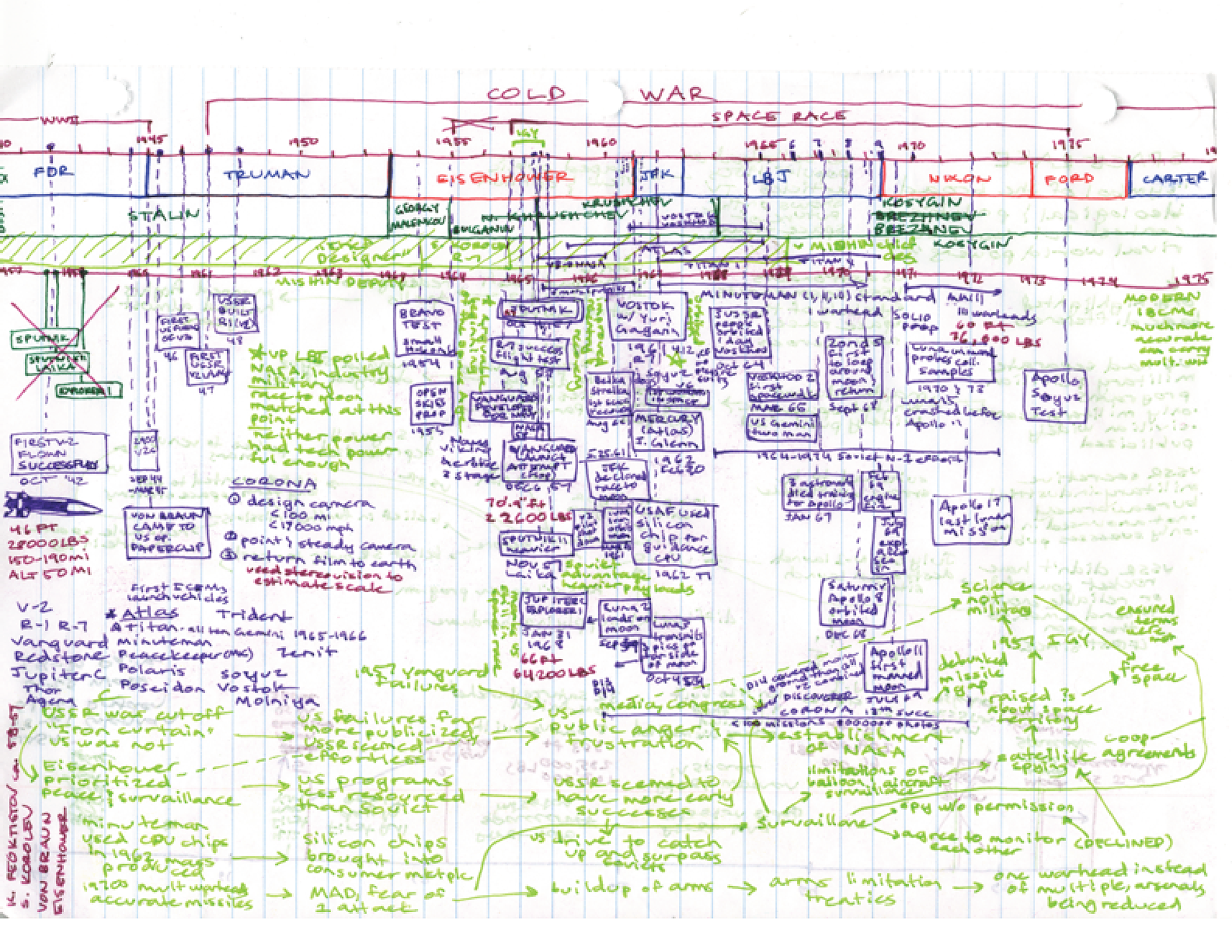
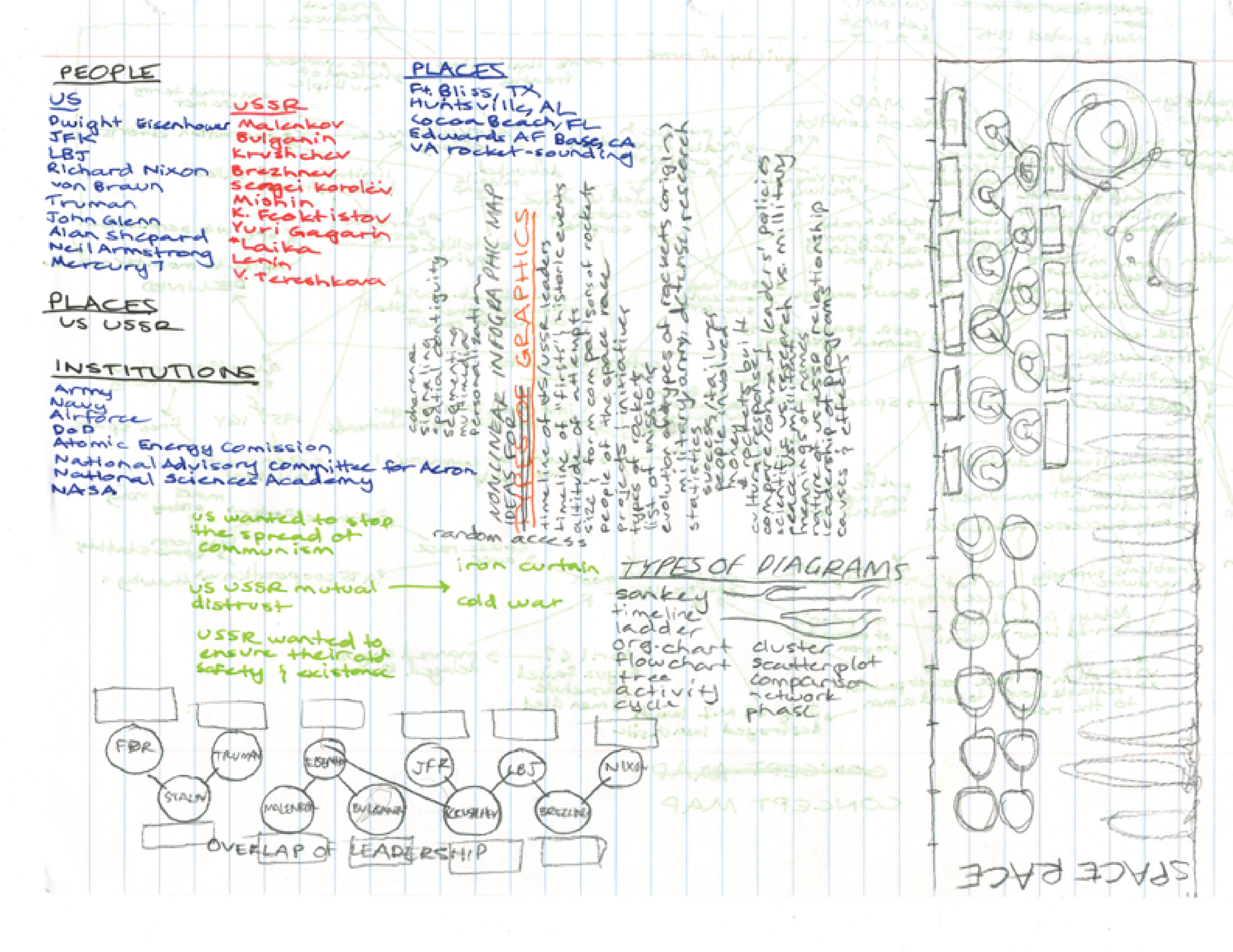
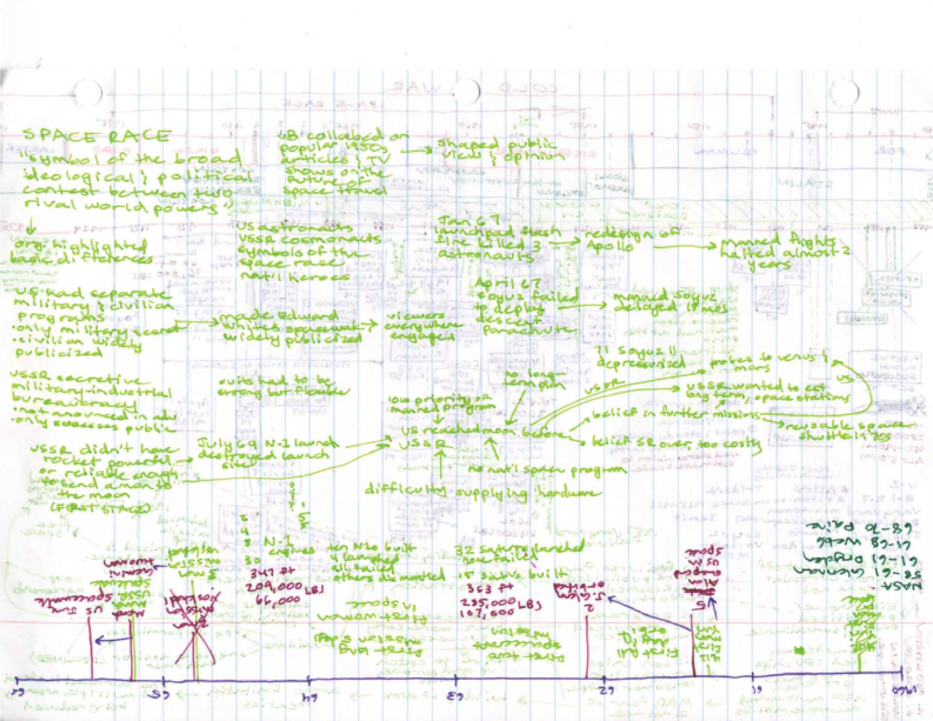
Using my notes (above) on the book "Promised the Moon" along with various journal articles on the space race, I organized my research in various ways to fit the prompt. Below on the left, I created a timeline of the events as well as the cause and effect relationships. In the second image I grouped the important players by people, places, institutions, and began mapping out my plans for different aspects of the infographic. The third page is a more distilled version of the cause and effect relationships relevant to the development of rockets and not just the space race as a whole, and the fourth is a mind map of all the ways the factors contributing to the space race interacted.

My first concept of the graphic shown above simply dropped the elements from my research into a template for the screen. However, the types of information seemed disparate, and at scale the text would be much too large. I decided to rework the composition in my second draft shown below to integrate the different types of information I wanted to communicate. Because there would be gaps in the image where the screens met, in my final draft I worked to place the text so it was continuous and easily readable.